Tutorial: Responsive Navigation with AlpineJS and TailwindCSS
Updated on June 15, 2020
Tweet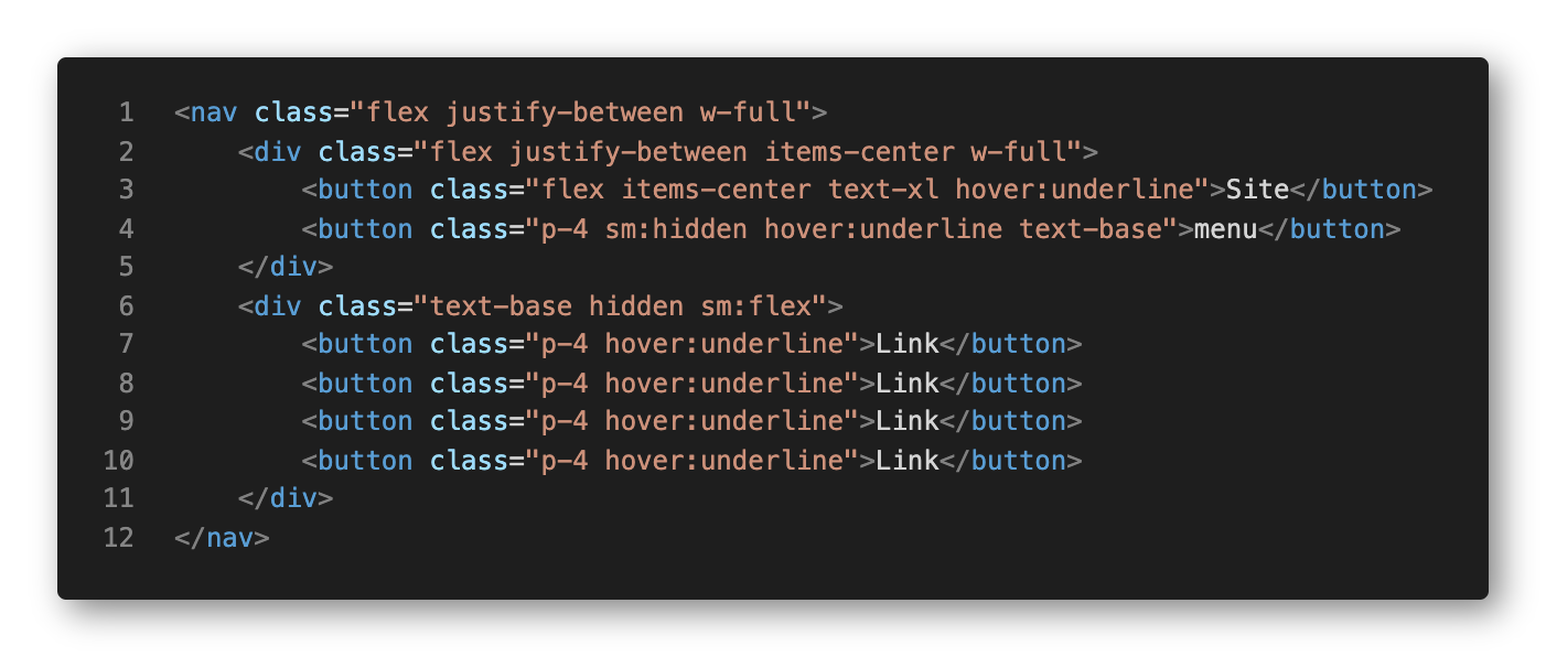
Making a dropdown menu or expandable with AlpineJS is crazy simple. Putting together a navigation bar with TailwindCSS is absolute cake. But then you turn your attention to your sites' responsiveness and the mobile experience and that is when you have to do some mental gymnastics.
AlpineJS and TailwindCSS never cross over in functionality or use, but wrapping your mind around how to use them together can sometimes be a bit challenging. At least at first. By the end, you wonder to yourself, why was that so difficult?!
Taking Baby Steps
Let's begin with a straight forward menu with no kind of responsiveness. We'll keep it basic and position our brand link to the left, and the navigation links grouped to the right. Pretty standard navigation layout used across most sites.
With that completed, let's add a menu button and put together the markup and CSS classes needed to go responsive. When the users' browser width is below 767px, we are going to show the new menu button and hide our menu.
Currently, our brand link is on the same level has the link group. Since we are using a flex layout, when on a mobile browser, we want the brand link and the menu button to be in the same group so we can control their layout as a unit.
We added our menu button as a sibling of the brand link and nested them in a div so that we can apply the flex properties appropriately. Notice that we have applied our first "responsive" classes. On the menu button we added md:hidden, which hides the button when the browser width is above our medium breakpoint, i.e. 767px. We also added a similar breakpoint to our link group. For the link group, we prefixed the flex class with an md: so that when we are above the medium breakpoint it displays, and when below, it is hidden.
At this point, the navigation is visually behaving how we want it to, albeit without any level of interaction. Let's bring in the heavy artillery and give this thing some life.
Bring on AlpineJS
We are about to hit our first gotcha when implementing AlpineJS. Let's go ahead and add our x-data property and start analyzing how this menu is supposed to behave and how to get it there.
We added the x-data property on the parent element and set open to false as default. On our menu button, we have also added a click event that toggles the open value between true and false.
In a situation where we implement a standard dropdown menu, we would have added the x-show property on our link group to achieve the show/hide behavior. But in this case, when the user is not on a mobile device, we need the menu to display and not default to hidden. So instead of using the x-show property, we used conditional classes to accomplish our mobile-aware navigation.
Technically we have a responsive navigation, but let's finish it off with some styling to make it look good.
Now for some Pizzazz
We added a few different classes to control the responsive behavior of our navigation. Starting from the outside in, we added flex-wrap and md:flex-no-wrap so that when we are below our medium breakpoint, the link group will open below our bar. The markup gymnastics came into play when working our link group. We needed to add flex-col and md:flex-row so that our buttons would break off onto their own rows. This creates a very usable menu for mobile users, but also maintains our original look when the user is using larger devices like tablets, laptops or desktops.
In the past, I would have given up at some point and just duplicated the menu links so I could individually control how they looked at their respective break points. These types of comprises are rarely necessary and may pose negative consequences to SEO, accessibility and usability. This not only kept the code dry, but it is easily maintainable by future developers.