Tutorial: Flexible Modal with AlpineJS and TailwindCSS
Updated on August 31, 2020
Tweet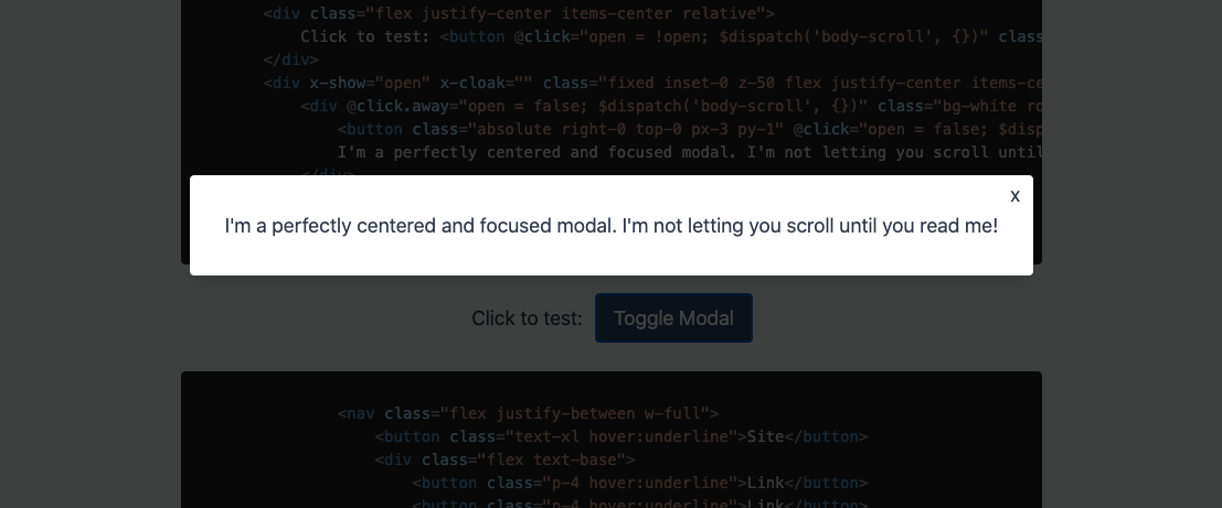
For years, I relied on Bootstrap for all my modal needs. I would copy that ridiculous modal boilerplate, pull in Bootstrap JS, and be "happy" with the results. Looking back, I feel like I just settled. In Bootstrap's defense, they coded for all the different situations that their users were pulling in their code for. So they needed to over-engineer it a bit.
I recently helped someone through an issue on StackOverflow where they were having a difficult time getting a modal working with their markup. Before that point, I had decided I wasn't going to put together a tutorial on making modals with AlpineJS since I believed the topic had been well covered, but in helping out the fellow developer, I realized that there was room on this great web for one more AlpineJS modal tutorial. And who knows, this could be the very tutorial that turns on the light bulb above your head and you finally understand the magic of AlpineJS!
What is a modal and why do I need one?
Modal's come in a few different flavors: Full page variants, sliding side panels, page-centered interactive or info boxes, etc. They all follow the same basic principle of pulling themselves out of the natural flow of the page markup. I tend to use modals when I have some functionality that doesn't need a full page to work and belongs in the context of the respective page. Whatever the reason you want to make a modal, it doesn't have to be difficult.
For this tutorial, I'm going to use AlpineJS for the interaction and TailwindCSS for the styling.
Let's start by keeping it simple
To start, we just need two elements: the button that opens the modal and the modal itself. We initialize AlpineJS with a simple x-data="{ open: false }". The button is set up to toggle the modal and we put an "x" within the modal to close it. This is the simplest, usable modal we could do, but it's not very flexible. If you can tell, it is not perfectly centered on our page. We could use some CSS tricks to get it be perfectly centered, but there is a better way to get it centered!
Wrap it like it's Christmas!
We wrapped our modal with a fixed div that covers the entire viewport. In addition, we swapped the absolute class for a fixed class. We need to use fixed so that the user can't just scroll away from our modal. The modal needs to be viewed! Now within this wrapper div, we can center our content box with "flex justify-center items-center".
Cool, so now we have our modal that follows the user, but it's just not getting enough attention. Let's add a semi-transparent background around our white content box, this will bring focus to the modal box. In addition, let's make it so that when the user clicks outside of the modal box, we also close the modal. This is expected behavior, so we will need to include it.
Hey, I'm Talking to You!
We are looking good! We could stop here, but there are some final touches we will add to really complete the modal. A nice open transition will smooth out the opening of the modal. Just a bit of polish to make it seem like we spent hours working on this modal.
If you haven't noticed yet, with the modal open, you are still able to scroll the page. We are going to want to put a stop to that. To do this, it takes a little bit of javascript and AlphineJS gymnastics. When the modal is open, we need to tell the body of the document to stay put and don't allow the user to scroll the content behind the modal. Let's see what this looks like.
AlpineJS Custom Events FTW!
You see what I did there!? AlpineJS has a really easy to use custom event API. I added the following custom event listener to modal component:
@body-scroll="document.body.style.overflowY = open ? 'hidden' : ''"
When a "body-scroll" custom event is emitted, we re-evaluate the open status of the modal and appropriately update the overflow-y CSS property of the body element and toggle the hidden value. Then on every click modal click event, we dispatch the custom event:
$dispatch('body-scroll', {})
Using the AlpineJS custom event API is a really fun way to react to user interactions and update different parts of your page. It takes a while to wrap your mind around the power of it, but once you do, it opens up a ton of possibilities.
And the "x-transition" attribute is just straight ridiculous. How was the internet built before AlpineJS?
The Possible Applications are Endless
We built a pretty simple modal, but even this modal can be edited to take the entire page, come in from the top, scroll content within itself, etc. Outside of this modal, this code could easily be updated so that you have a panel sliding in and out of the right of the page. I do enjoy a well placed panel.
Modals don't need to be scary or complicated. AlpineJS and TailwindCSS make throwing together a modal crazy easy. I didn't focus too much on TailwindCSS in this tutorial as the classes are pretty self-explanatory, but I did want to highlight the "inset-0" class that we used on the modal wrapper div. This class pulls the div so that takes the entire viewport. Very handy indeed! If you use both AlpineJS and TailwindCSS, you should be able to copy the above code into your project and it will just work.
Happy coding everyone!